

CSS
반응형 웹 구현하기 css 코딩
반응형 웹 구현하기 css 코딩
안녕하세요.
이번시간에는 앞의 강좌에 이어 우리가 만든 HTML코드에 CSS 코드를 반응형으로 만들겠습니다.
우선 header부터 만지겠습니다.
반응형으로 제작하기 때문에 header태그의 가로 길이는 100%로 지정하여 어느 해상도에나 대응하도록 합니다.
그리고 여기서 모바일과PC의 구분은 아이폰에서 가장 큰 12 Pro Max가 뷰포트 적용했을 때 가로길이 428px이라서 그것보다 좀 더 큰 500px로 하겠습니다.
먼저 header를 조정하는 동안 section, footer태그는 방해가 되니 안보이게 display:none처리를 하겠습니다.
그리고 뷰포트를 적용하겠습니다.
<meta name="viewport" content="width=device-width, initial-scale=1">
<style>section,footer{display:none}</style>
적용하면 아래와 같죠.
<!DOCTYPE html>
<html>
<head>
<meta charset="utf-8" />
<meta name="viewport" content="width=device-width, initial-scale=1">
<style>section,footer{display:none}</style>
<title>pinkcoding</title>
</head>
<body>
    <header>
        <button></button>
        <h1>pinkcoding</h1>
    </header>
    <section>
        <img src="/material/ex/mickey.jpg" alt="disney" />
        <p>coding etude site : pinkcoding</p>
        <nav>
            <ul>
                <li><a href="/class/web/HTML/">HTML</a></li>
                <li><a href="/class/web/CSS/">CSS</a></li>
                <li><a href="/class/web/jQuery/">jQuery</a></li>
                <li><a href="/class/web/MySQL/">MySQL</a></li>
                <li><a href="/class/web/PHP/">PHP</a></li>
            </ul>
        </nav>
    </section>
    <footer>
        <p>pinkcoding</p>
    </footer>
</body>
</html>
결과는 바로 아래에서 확인할 수 있습니다.
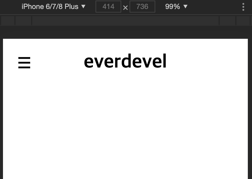
header에서 모바일용과 데스크탑용 차이는 세줄마크가 보이는가 안보이는가의 차이입니다.
0에서 500px까지 모바일로하고 501px이상을 데스크탑용으로하면 미디어쿼리는 다음과 같습니다.
/* mobile */
@media screen and (min-width:0px) and (max-width:500px){

}

/* pc */
@media screen and (min-width:501px){

}
모바일,pc 공용으로 헤더는 가로길이 100%, header태그 안의 h1태그는 텍스트를 가운데 정렬하고
모바일에서 보이는 세줄마크는 세줄 이미지 백그라운드로 설정하고 배경을 반복하지 않습니다. 가로 세로 길이는 2.5rem으로 크기는 반으로 줄여줍니다.
세줄마크는 데스크탑에서는 안보이게해야하므로 display:none처리합니다.
그럼 코드는 다음과 같습니다.
header{width:100%}
header h1{text-align:center}

/* mobile */
@media screen and (min-width:0px) and (max-width:500px){
header button{position:absolute;left:1rem;background:url('/material/ex/3line.png') no-repeat;width:2.5rem;height:2.5rem;border: none;transform: scale(0.5);}
}

/* pc */
@media screen and (min-width:501px){
header button{display:none}
}
적용하고 결과를 봅시다.
<!DOCTYPE html>
<html>
<head>
<meta charset="utf-8" />
<meta name="viewport" content="width=device-width, initial-scale=1">
<style>
section,footer{display:none}

header{width:100%}
header h1{text-align:center}

/* mobile */
@media screen and (min-width:0px) and (max-width:500px){
header button{position:absolute;left:1rem;background:url('/material/ex/3line.png') no-repeat;width:2.5rem;height:2.5rem;border: none;transform: scale(0.5);}
}

/* pc */
@media screen and (min-width:501px){
header button{display:none}
}
</style>
<title>pinkcoding</title>
</head>
<body>
    <header>
        <button></button>
        <h1>pinkcoding</h1>
    </header>
    <section>
        <img src="/material/ex/mickey.jpg" alt="disney" />
        <p>coding etude site : pinkcoding</p>
        <nav>
            <ul>
                <li><a href="/class/web/HTML/">HTML</a></li>
                <li><a href="/class/web/CSS/">CSS</a></li>
                <li><a href="/class/web/jQuery/">jQuery</a></li>
                <li><a href="/class/web/MySQL/">MySQL</a></li>
                <li><a href="/class/web/PHP/">PHP</a></li>
            </ul>
        </nav>
    </section>
    <footer>
        <p>pinkcoding</p>
    </footer>
</body>
</html>
결과는 바로 아래에서 확인할 수 있습니다.
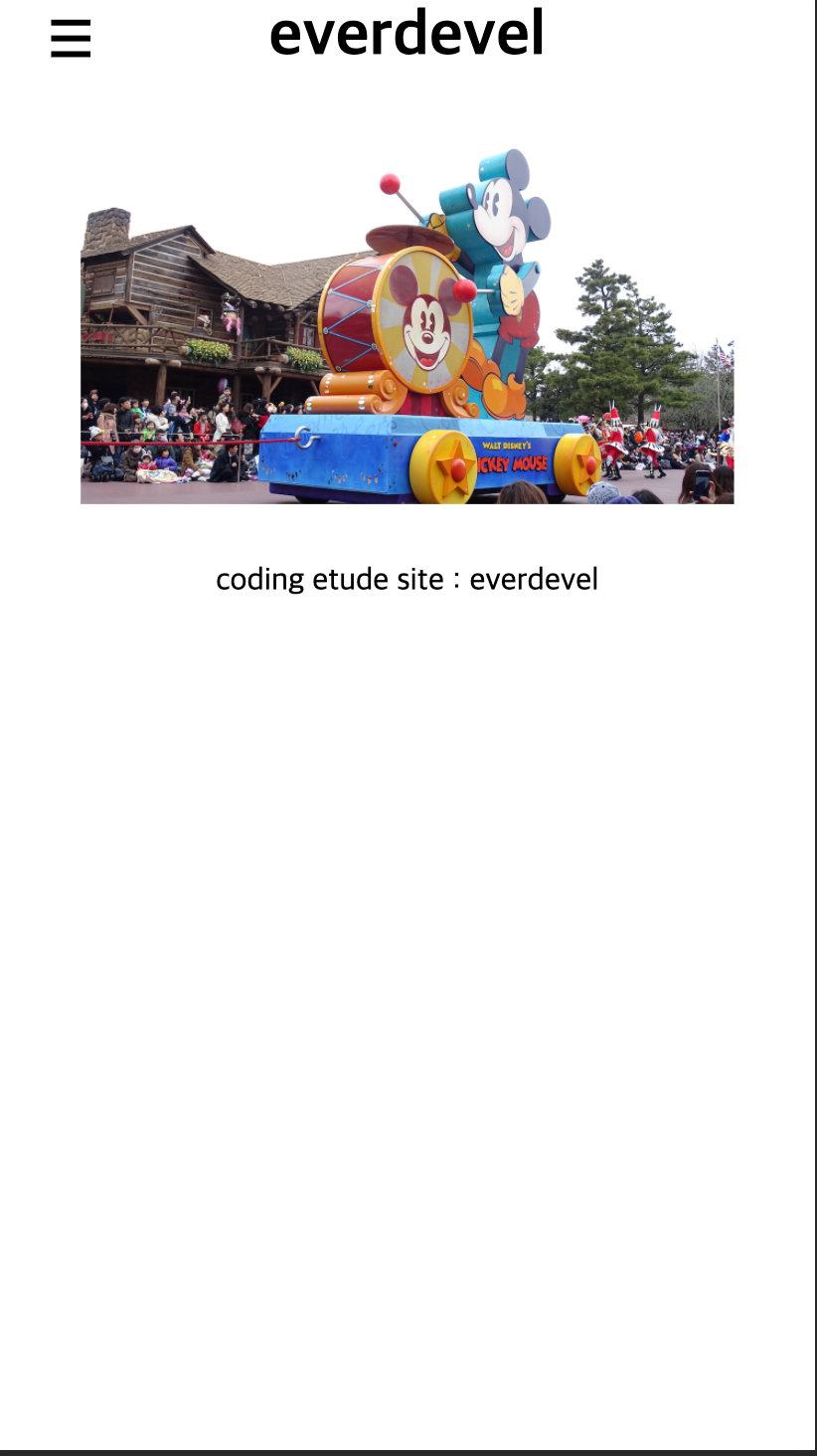
결과 : 모바일
결과 : PC
다음은 section 태그입니다.
section태그안에 있는 nav태그는 PC에서 보이며 모바일에서는 보이지 않습니다.
그 외에는 똑같습니다.
그렇다면 다음과 같이 코드를 사용하겠습니다.
우선 display:none 처리된 section을 지워주고요.
section,footer{display:none}
위의 코드를 아래처럼 변경하는거죠.
footer{display:none}
그리고 모든 태그의 margin;padding을 0으로 맞춥니다.
*{padding:0;margin:0}
*은 컴퓨터에서 선택할 때 모든것을 의미하죠. 연산할때는 곱셈이지만요.
이미지는 창 크기의 80% 정도만 가로 길이로 설정하고 가운데 정렬하겠습니다.
section태그 안에 있는 nav태그는 모바일에서는 안보이게 처리합니다.
PC에서는 메뉴가 세로로 나열되게 할게요.
링크는 밑줄 없애고 검은색으로 하겠습니다.
section{width:100%}
section img{width:80%;margin:0 auto;display:block}
section p{text-align:center;}

/* mobile */
@media screen and (min-width:0px) and (max-width:500px){
section nav{display:none}
}

/* pc */
@media screen and (min-width:501px){
section nav{width:100%}
section nav ul{list-style:none;width:100%;margin:0 auto}
section nav ul li{clear:both;text-align:center;margin-top:20px}
section nav ul li:last-of-type{margin-right:0}
section nav ul li a{text-decoration:none;color:#000000}
}
적용하면 다음과 같습니다. 결과를 봅시다.
<!DOCTYPE html>
<html>
<head>
<meta charset="utf-8" />
<meta name="viewport" content="width=device-width, initial-scale=1">
<style>
*{padding:0;margin:0}
footer{display:none}

header{width:100%}
header h1{text-align:center}
section{width:100%}
section img{width:80%;margin:30px auto;display:block}
section p{text-align:center;}

/* mobile */
@media screen and (min-width:0px) and (max-width:500px){
header button{position:absolute;left:1rem;background:url('/material/ex/3line.png') no-repeat;width:2.5rem;height:2.5rem;border: none;transform: scale(0.5);}
section nav{display:none}
}

/* pc */
@media screen and (min-width:501px){
header button{display:none}
section nav{width:100%}
section nav ul{list-style:none;width:100%;margin:0 auto}
section nav ul li{clear:both;text-align:center;margin-top:20px}
section nav ul li:last-of-type{margin-right:0}
section nav ul li a{text-decoration:none;color:#000000}
}
</style>
<title>pinkcoding</title>
</head>
<body>
    <header>
        <button></button>
        <h1>pinkcoding</h1>
    </header>
    <section>
        <img src="/material/ex/mickey.jpg" alt="disney" />
        <p>coding etude site : pinkcoding</p>
        <nav>
            <ul>
                <li><a href="/class/web/HTML/">HTML</a></li>
                <li><a href="/class/web/CSS/">CSS</a></li>
                <li><a href="/class/web/jQuery/">jQuery</a></li>
                <li><a href="/class/web/MySQL/">MySQL</a></li>
                <li><a href="/class/web/PHP/">PHP</a></li>
            </ul>
        </nav>
    </section>
    <footer>
        <p>pinkcoding</p>
    </footer>
</body>
</html>
결과는 바로 아래에서 확인할 수 있습니다.
디자인이 형펀없습니다. ㅜㅜ 제가 디자인 감각이 없습니다. 반응형만 봐주시기 바랍니다. ㅜㅜ
결과 : 모바일
결과 : PC
마지막으로 footer를 처리하겠습니다.
푸터는 그냥 푸터윗라인 검은색 선 하나 긋고 문구를 가운데 정렬하겠습니다.
공통사항이므로 미디어쿼리는 사용하지 않습니다.
footer{clear:both;width:100%;margin-top:20px;padding:10px 0;border-top:1px solid #000000;text-align:center}
아, footer{display:none} 코드는 제거해 주세요.
<!DOCTYPE html>
<html>
<head>
<meta charset="utf-8" />
<meta name="viewport" content="width=device-width, initial-scale=1">
<style>
*{padding:0;margin:0}

header{width:100%}
header h1{text-align:center}
section{width:100%}
section img{width:80%;margin:30px auto;display:block}
section p{text-align:center;}
footer{clear:both;width:100%;margin-top:20px;padding:10px 0;border-top:1px solid #000000;text-align:center}

/* mobile */
@media screen and (min-width:0px) and (max-width:500px){
header button{position:absolute;left:1rem;background:url('/material/ex/3line.png') no-repeat;width:2.5rem;height:2.5rem;border: none;transform: scale(0.5);}
section nav{display:none}
}

/* pc */
@media screen and (min-width:501px){
header button{display:none}
section nav{width:100%}
section nav ul{list-style:none;width:100%;margin:0 auto}
section nav ul li{clear:both;text-align:center;margin-top:20px}
section nav ul li:last-of-type{margin-right:0}
section nav ul li a{text-decoration:none;color:#000000}
}
</style>
<title>pinkcoding</title>
</head>
<body>
    <header>
        <button></button>
        <h1>pinkcoding</h1>
    </header>
    <section>
        <img src="/material/ex/mickey.jpg" alt="disney" />
        <p>coding etude site : pinkcoding</p>
        <nav>
            <ul>
                <li><a href="/class/web/HTML/">HTML</a></li>
                <li><a href="/class/web/CSS/">CSS</a></li>
                <li><a href="/class/web/jQuery/">jQuery</a></li>
                <li><a href="/class/web/MySQL/">MySQL</a></li>
                <li><a href="/class/web/PHP/">PHP</a></li>
            </ul>
        </nav>
    </section>
    <footer>
        <p>pinkcoding</p>
    </footer>
</body>
</html>
결과는 바로 아래에서 확인할 수 있습니다.
결과 : 모바일
결과 : PC
의도대로는 보이지만 모바일의 푸터의 위치가 형편없네요.
하단으로 고정을 시켜야겠습니다.
모바일에서만 footer를 하단으로 고정시키겠습니다.
/* mobile */
@media screen and (min-width:0px) and (max-width:500px){
footer{position:absolute;bottom:0}
}
그럼 적용해 봅시다.
<!DOCTYPE html>
<html>
<head>
<meta charset="utf-8" />
<meta name="viewport" content="width=device-width, initial-scale=1">
<style>
*{padding:0;margin:0}

header{width:100%}
header h1{text-align:center}
section{width:100%}
section img{width:80%;margin:30px auto;display:block}
section p{text-align:center;}
footer{clear:both;width:100%;margin-top:20px;padding:10px 0;border-top:1px solid #000000;text-align:center}

/* mobile */
@media screen and (min-width:0px) and (max-width:500px){
header button{position:absolute;left:1rem;background:url('/material/ex/3line.png') no-repeat;width:2.5rem;height:2.5rem;border: none;transform: scale(0.5);}
section nav{display:none}
footer{position:absolute;bottom:0}
}

/* pc */
@media screen and (min-width:501px){
header button{display:none}
section nav{width:100%}
section nav ul{list-style:none;width:100%;margin:0 auto}
section nav ul li{clear:both;text-align:center;margin-top:20px}
section nav ul li:last-of-type{margin-right:0}
section nav ul li a{text-decoration:none;color:#000000}
}
</style>
<title>pinkcoding</title>
</head>
<body>
    <header>
        <button></button>
        <h1>pinkcoding</h1>
    </header>
    <section>
        <img src="/material/ex/mickey.jpg" alt="disney" />
        <p>coding etude site : pinkcoding</p>
        <nav>
            <ul>
                <li><a href="/class/web/HTML/">HTML</a></li>
                <li><a href="/class/web/CSS/">CSS</a></li>
                <li><a href="/class/web/jQuery/">jQuery</a></li>
                <li><a href="/class/web/MySQL/">MySQL</a></li>
                <li><a href="/class/web/PHP/">PHP</a></li>
            </ul>
        </nav>
    </section>
    <footer>
        <p>pinkcoding</p>
    </footer>
</body>
</html>
결과는 바로 아래에서 확인할 수 있습니다.
모바일에 푸터가 하단으로 고정되었습니다.
결과 : 모바일
결과만 보면 모바일 영역이 많아서 nav를 숨길이유가 없네요;;
학습용이긴하지만 뭔가 제가 보기에도 참 그렇습니다.
그래도 봐주셔서 감사합니다. ^^


